CLICK ON CHART ENLARGE
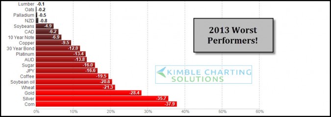
2013 has been good for stocks, the above table reflects its not been the best of years for certain assets. These are the worst performers so far YTD. As 2013 is nearing a close I wanted to share these worst performers and apply some Power of the Pattern analysis and sentiment readings to them in case some still believe in the ole concept of “Buy low and Sell higher!”
CLICK ON CHART TO ENLARGE
The above 9-pack are charts on these poor performing assets with current bullish sentiment readings with some pattern analysis applied.
If the idea of picking up some hard hit assets on support with very few bulls and staying abreast of these patterns on an ongoing basis could be of benefit to you, our “Weekly Sector/Commodity Sentiment Extremes” research report might be of interest to you.
This report is sent at least weekly to members, with opportunities sent to them any day of the week that key opportunities present themselves. Investors can get the research for as little as $29 per month or we offer a 50% discount on our Triple Play advantage program.
Will some of 2013’s biggest losers turn into 2014’s best performers? Often times one years losers do well in the following year….stay tuned and keep abreast of key opportunities in 2014 with the Power of the Pattern’s weekly Sector/Commodity Sentiment Extremes report.
–
–


