
 CLICK ON CHART TO ENLARGE
This chart takes a look at the Shanghai Index over the past couple of decades. As you can see, this index remains inside of a well defined rising channel over the past 20-years.
From 2007 to 2014 this index had little to brag about, as it lost about two-thirds of its value in that time frame. The large decline took the index from the top of this channel (resistance) to bottom of this channel (support) in a 5-year time frame. The index broke above a 4-year falling channel on a breakout above line (1).
Two different resistance lines came into play at (2). The Shanghai index paused at this resistance for 2 months before breaking out at (2).
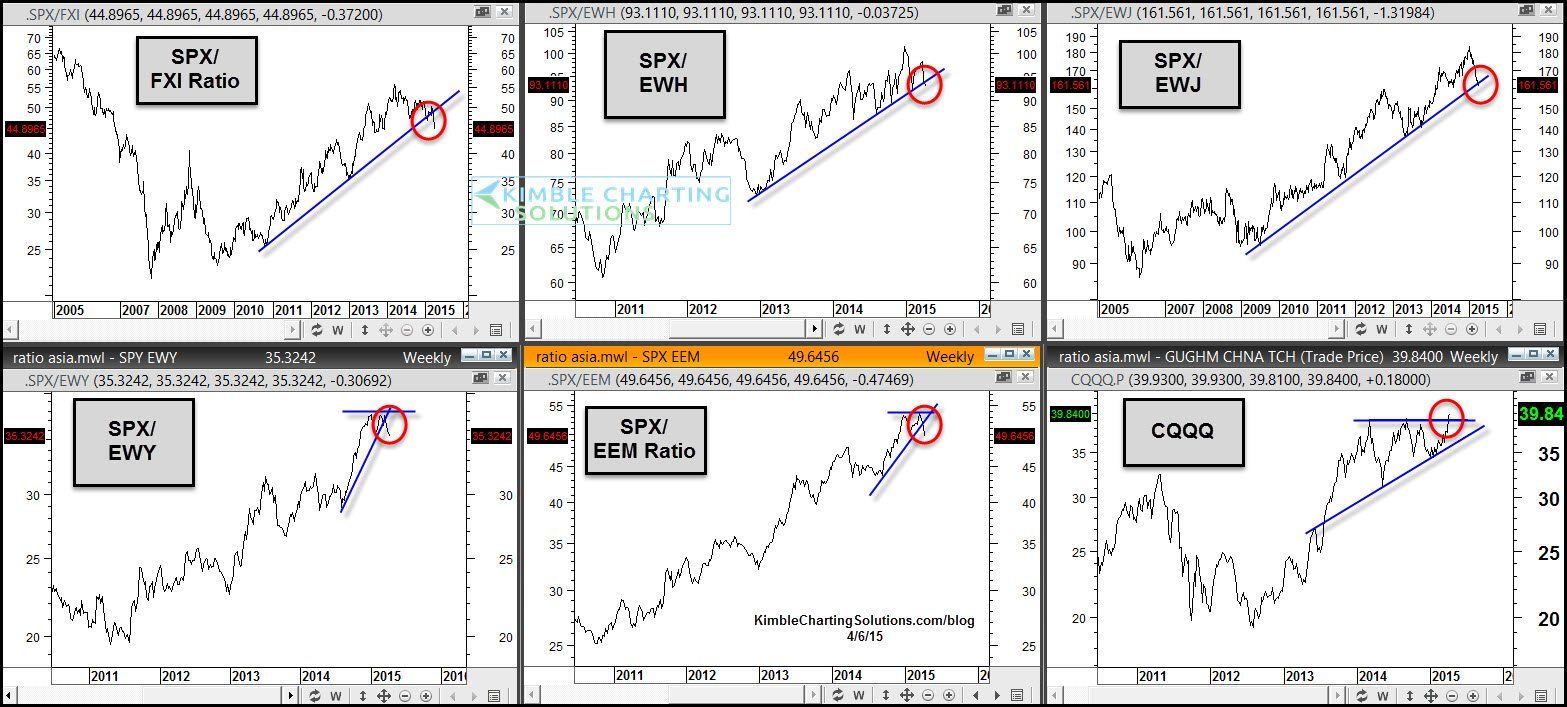
Earlier in the week the Power of the Pattern shared the 6-pack below, reflecting that several ratios involving this region of the world were breaking down. See post HERE
CLICK ON CHART TO ENLARGE
Five of these six charts are ratios. When the ratios are moving up, the S&P 500 is stronger compared to each of these ETF’s. The upper left chart (SPX/FXI ratio) is breaking support, which reflects that China is reflecting relative strength against the S&P 500 that we haven’t seen in the past 5-years. As you can see, several of these ratios are working on breaking support, reflecting strength of the ETF over the S&P 500.
The lower right chart reflects a breakout from the bullish ascending triangle that CQQQ has created over the past couple of years.
Full Disclosure- Power of the Pattern suggested that Premium Members either own the Long FXI/SPX pair trade or own FXI our right. This trade has been suggested for the past couple of weeks. If would like to receive this type of research daily, I would be honored if you were a Premium Member.
Sign up for Premium Membership and research options can be found by clicking the button below 
