
 CLICK ON CHART TO ENLARGE
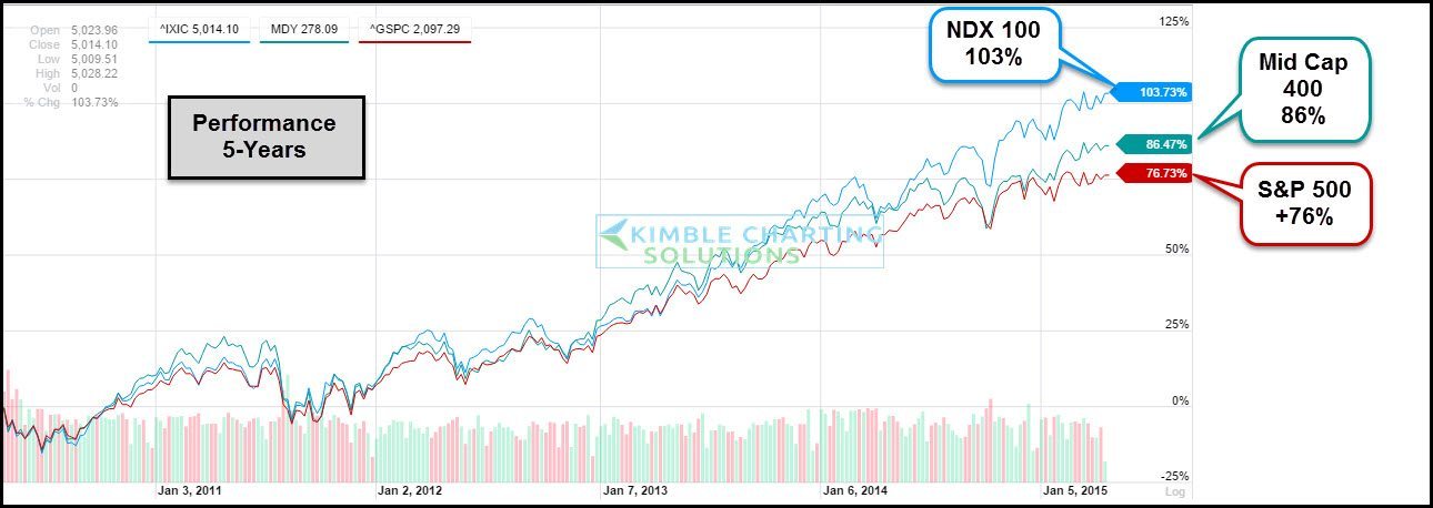
When looking at performance over the past 1, 2 and 5-year time frames, the NDX 100 has out performed the S&P 500 and Small Caps (Russell 2000) in each of these time windows. The chart below looks at the performance over the past 5-years.
The top chart reflects an attempt by this strong index to break above monthly closing highs in 2000, represented by line (1) and a resistance line (2), which is tied to the lows in 1990, 2002 and 2008. These lines both meet at price point (3) above.
 CLICK ON CHART TO ENLARGE
The NDX remains the “leader of the pack” from a performance perspective. A “Break Out” at (3) above would be a positive for the Tech sector and could influence other markets U.S. markets in a positive way.
At this time our Shoe Box Indicator, High Yields, Advance/Declines and Discretionary/Staples ratio are sending OK messages about the market in general. With these messages being sent, it increases the odds the NDX can “Break Free” from these resistance lines.
–
