

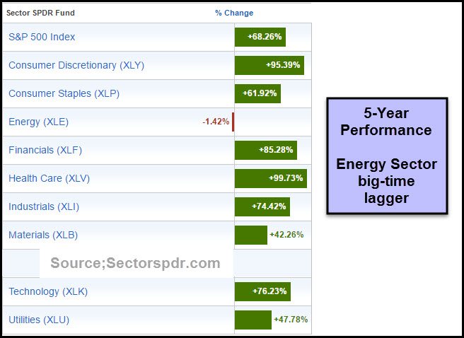
Below looks at the performance of the S&P 500 Sectors, looking back 5-years. The winner for the lowest performance is the Energy Sector (-1.42%). XLE is lagging the S&P 500 by almost 70%, in just 5-years. “Time for them to rally?”
CLICK ON CHART TO ENLARGE
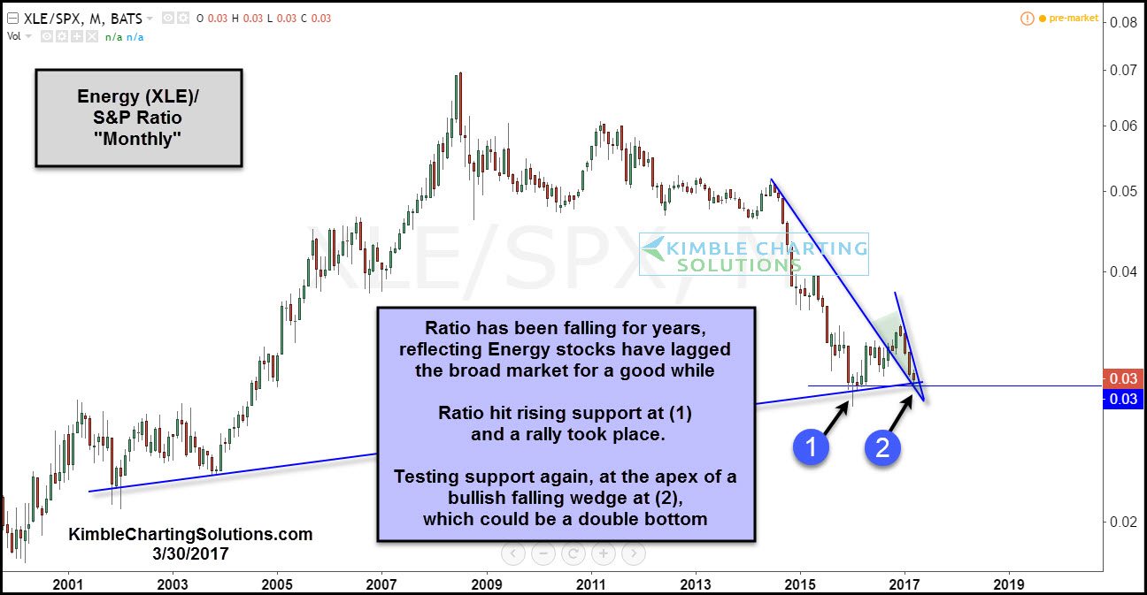
Below looks at the Energy ETF (XLE)/S&P 500 ratio over the past 17-years and why we find this pattern worth looking closer into.
CLICK ON CHART TO ENLARGE
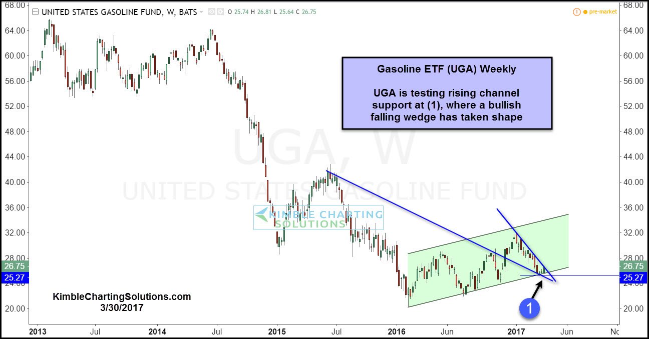
The pattern above presents a nice entry point, with a stop below the support test at (2). Another test of support in this space is taking place in the UGA chart below.
CLICK ON CHART TO ENLARGE
From a long-term trend perspective, no doubt the trend in both of the charts above is down (lower highs and lower lows and below long-term moving averages). If one is a trend follower, we doubt these ideas are of interest to you.
If one likes to buy low in hard hit sectors with tight stop loss parameters, we find both of these charts very interesting at this time, due to being out of favor and testing key support levels.
