
by Chris Kimble | Nov 3, 2020 | Kimble Charting
The S&P 500 and the Nasdaq don’t have much to brag about the past 90-days, as their performance has been near flat. It also hasn’t paid a great deal to be long bonds, as popular bond ETF (TLT) has declined over 6%. What asset has it paid to own over...
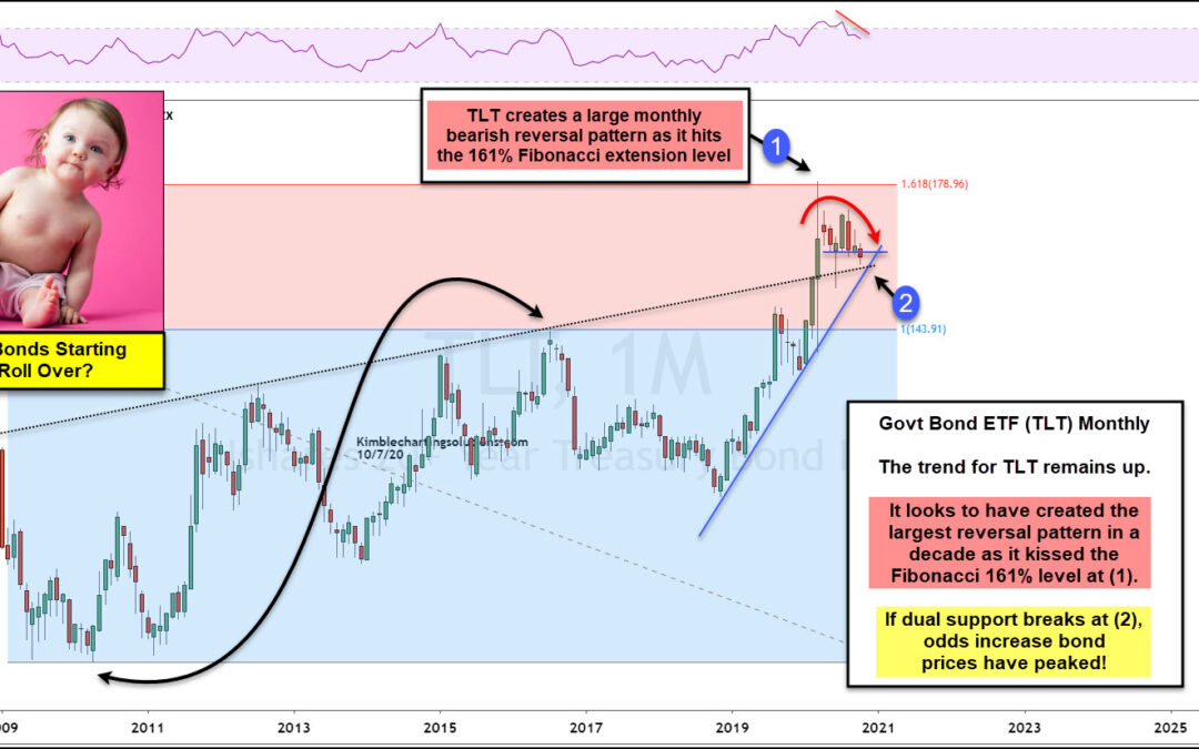
by Chris Kimble | Oct 7, 2020 | Kimble Charting
Are Government bonds creating a peak and starting to roll over? Possible! What happens at the support test (2) will go a long way to answering this question. This chart looks at Government bond ETF (TLT) on a monthly basis, where Fibonacci was applied to the 2010 lows...
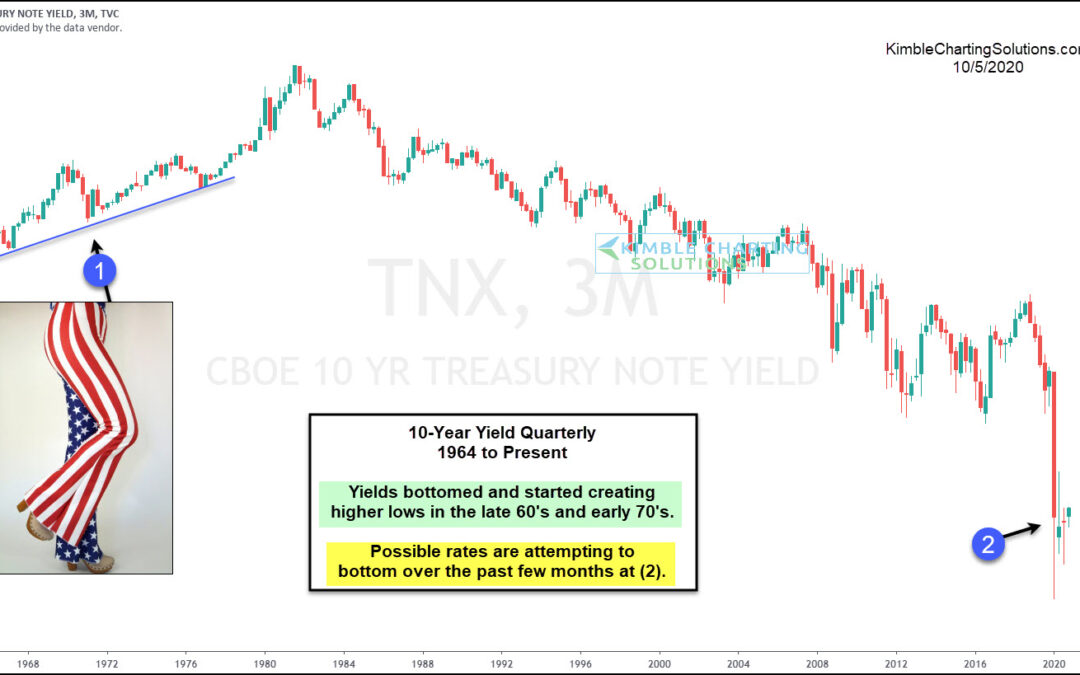
by Chris Kimble | Oct 5, 2020 | Kimble Charting
Are interest rates attempting to create a long-term bottoming pattern over the last 6-months? Possible! This chart looks at the yield on the 10-year note, on a quarterly basis since the early 1960s. In the late 1960s and early 1970s, yields started creating higher...
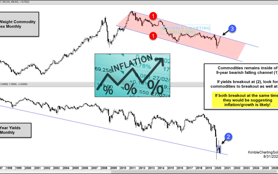
by Chris Kimble | Aug 31, 2020 | Kimble Charting
Recently Federal Reserve Chair Jay Powell said he is targeting inflation. Perhaps the market is seeing something similar. This prompts today’s question (and chart): Are the markets about to send a new message regarding inflation? Today’s chart “2-pack” highlights a...
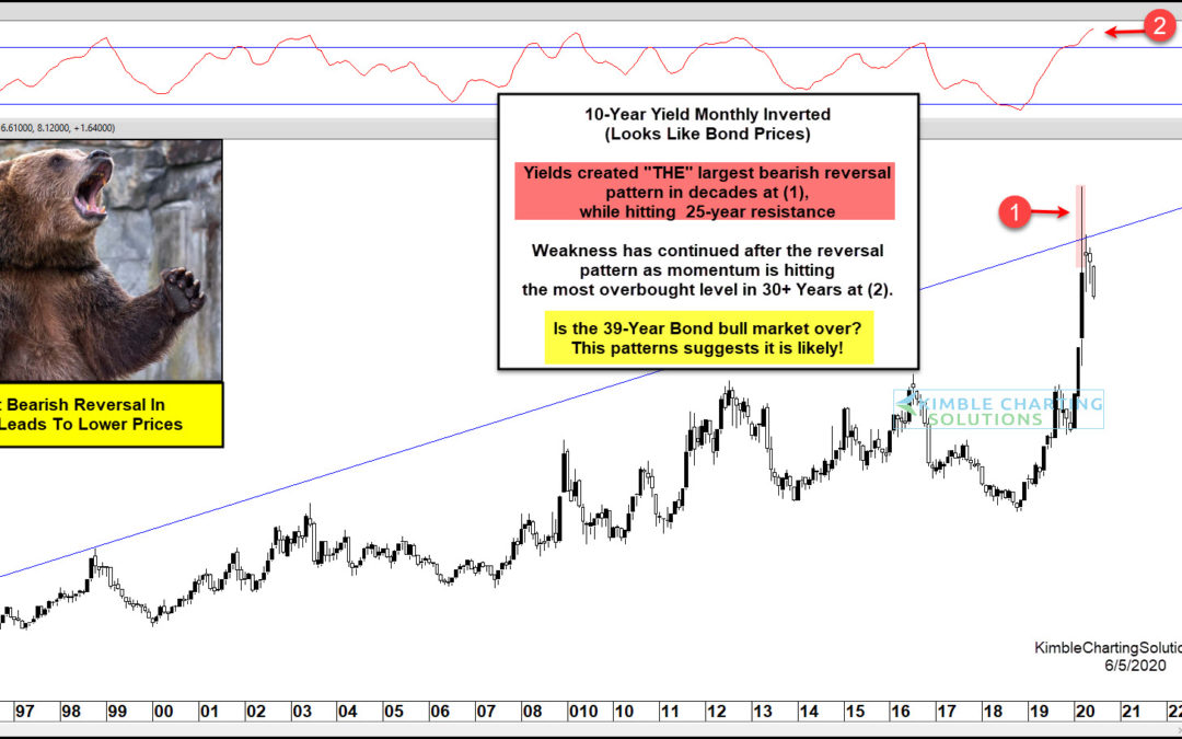
by Chris Kimble | Jun 5, 2020 | Kimble Charting
10 Year US Treasury Bond Yield “inverted” Chart This chart should look familiar, as I’ve shared and updated it a few times to alert clients and readers. It is the 10 Year US Treasury Yield Chart… inverted. As you know, bond yields and price move in opposite...
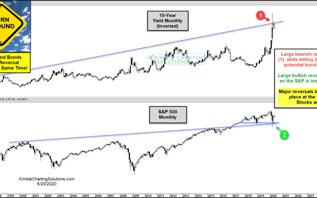
by Chris Kimble | May 20, 2020 | Kimble Charting
The March crash was pretty much an everything crash. But nearly as fast as the market crashed, it’s come back. In today’s chart, we look at two very important asset classes: stocks and bonds. Stocks are represented by the S&P 500 Index and bonds are shown by an...
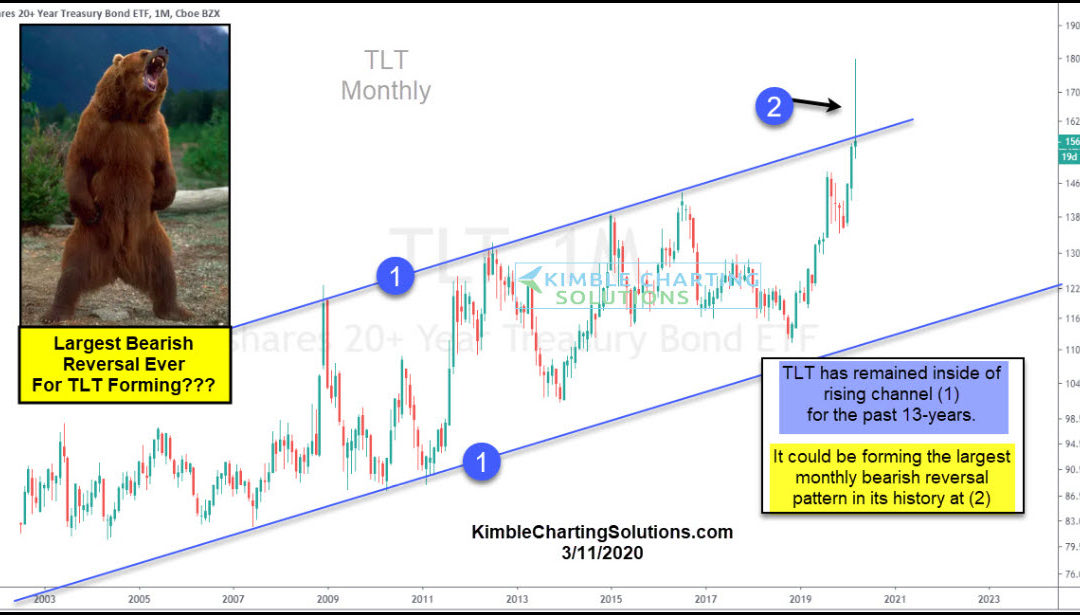
by Chris Kimble | Mar 13, 2020 | Kimble Charting
The financial markets are panicking and it’s producing some huge swings across asset classes. One asset that may be producing a monster reversal is treasury bonds (TLT). The flight to safe havens produced a sharp rise in the 20+ Year US Treasury Bond ETF (TLT)....

by Chris Kimble | Sep 7, 2019 | Kimble Charting
The rally in Silver prices has been fast and furious, producing a steep up-trend in the Silver ETF and Silver Futures charts. A similar rally can be seen in treasury bond yields, specifically the 10-Year Treasury Bond Yield In fact, treasury bond yields and silver...
