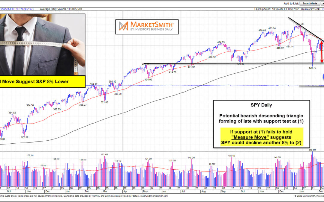
by Chris Kimble | Mar 7, 2022 | Kimble Charting
The financial markets remain volatile as inflation, supply chain issues, and serious geopolitical events cloud the immediate future. This volatility has manifested itself into a bearish descending triangle on the broad U.S. stock market index the S&P 500. Looking...
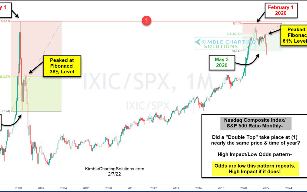
by Chris Kimble | Feb 7, 2022 | Kimble Charting
Tech stocks have gotten off to a poor start this year, as investors continued their buying strike against growth stocks. This is exemplified in today’s ratio chart, as we track the long-term price performance of the Nasdaq Composite versus the S&P 500 Index....
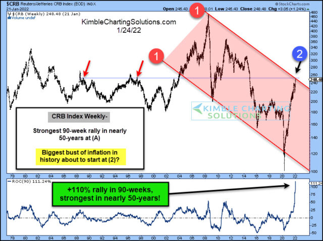
by Chris Kimble | Jan 28, 2022 | Kimble Charting
The supply chain has dealt with several issues over the past couple of years, as consumers and businesses have been forced to navigate a tricky “COVID” landscape. Commodity prices (in general) have risen, while enduring some big swings. Today we look at a commodity...
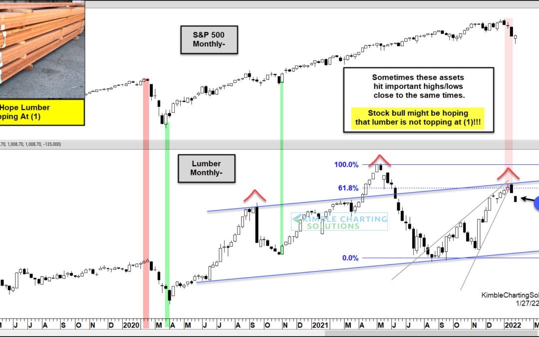
by Chris Kimble | Jan 27, 2022 | Kimble Charting
Commodities were already in a slump when coronavirus hit in 2020. That crash sent commodities to the lowest levels in decades. A quick economic rebound led to a return of demand which in turn led to shortages in 2021 and into 2022. So now what? Well, if you look at...
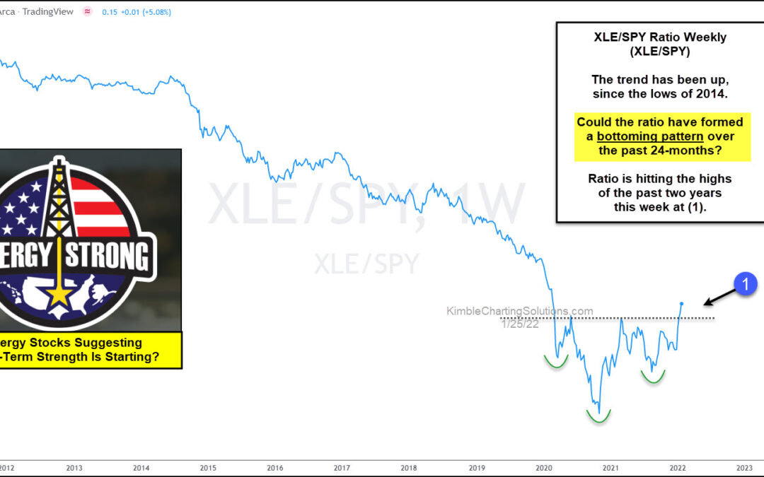
by Chris Kimble | Jan 26, 2022 | Kimble Charting
Energy stocks spent the decade of 2010 to 2020 mired in weakness… but is that trend coming to an end? The past two years have seen the Energy Sector (XLE) surge as Crude Oil has rallied back over $80. Today’s chart is a long-term “weekly” ratio chart of the Energy...
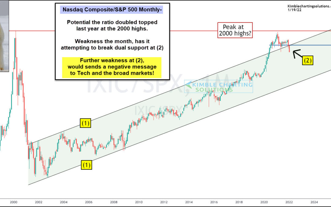
by Chris Kimble | Jan 19, 2022 | Kimble Charting
One theme over the past several months has been tech stock’s under-performance. And 2022 seems to be amplifying this theme as we kick off the new year. Today’s chart focus is on the ratio of the Nasdaq Composite to the S&P 500 Index. We have shared this...
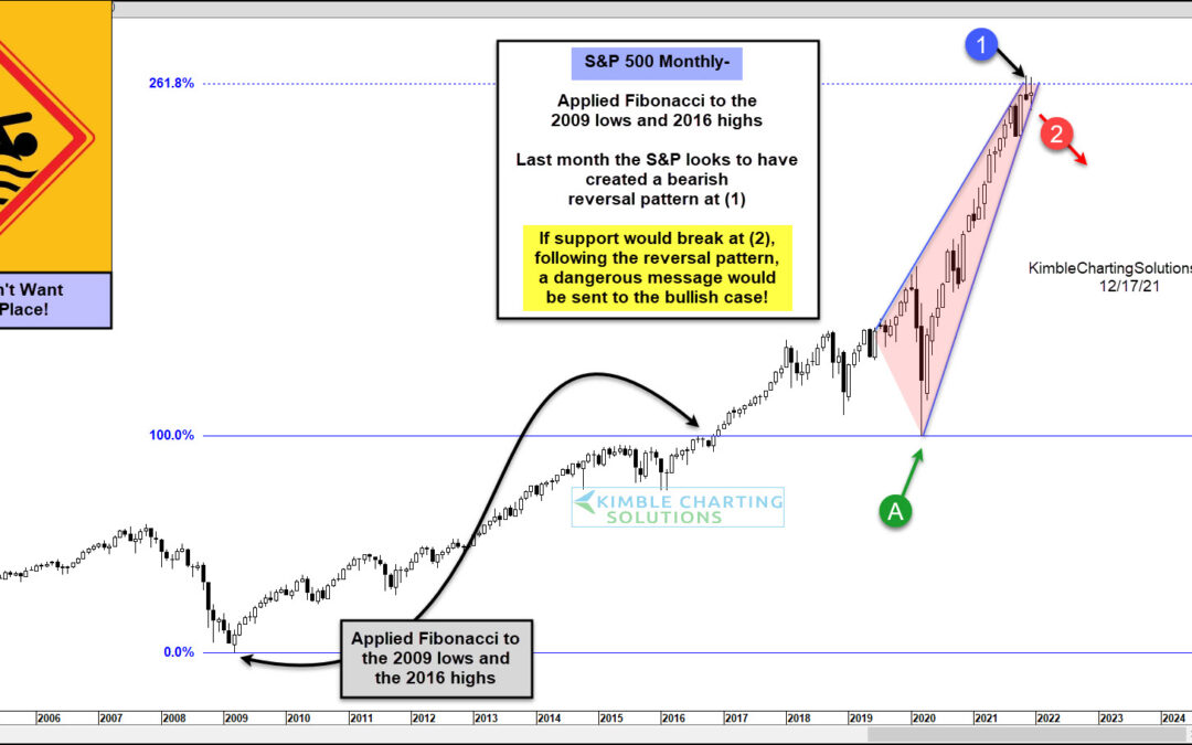
by Chris Kimble | Dec 17, 2021 | Kimble Charting
Rising stock market volatility has made for a very tough trading environment for investors. And while stocks remain elevated, several key indexes and indicators are flashing caution. Last week, I highlighted an important tech stocks ratio that is teetering. And today,...
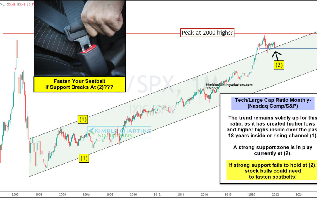
by Chris Kimble | Dec 8, 2021 | Kimble Charting
The U.S. economy and stock markets have been lead by technology companies (and stocks) for nearly 20 years. And this dynamic is on full display in today’s chart. Below is a long-term “monthly” ratio chart of the Nasdaq Composite to S&P 500 Index. In short, if this...
